What Does Fisheries Economics Look Like?
How we gave 238 IIFET research abstracts their own visual identity, and what the process taught us about turning research into something people can recognise and rediscover.
On Monday, researchers, policymakers and people from the fishing industry will gather in Tórshavn for IIFET 2026.
The programme covers everything from aquaculture losses and distant-water fleets to marine invasive species, seaweed cultivation and the hidden origins of fishmeal.
Most of that work arrives in the same visual form: a title followed by a block of text.
When we began building the IIFET experience in Luttaka, we wanted to see whether each of the 238 published abstracts could also have a visual identity of its own.
Not a decorative image added at the end.
An image that came from the particular question or tension inside the research.
The easy answer would have been generic fish
A shared conference illustration would have been simple. So would a collection of interchangeable boats, nets and fish.
That would have made the programme look consistent. It would not have helped anyone distinguish one piece of research from another.
An abstract about people’s acceptance of marine invasive species is not visually the same problem as an abstract about food loss in salmon farming.
A paper about distant-water fleets and their local consequences is concerned with conflicting scales.
A study of seaweed cultivation costs is about removing steps, aligning processes and making production possible at a different scale.
Research into DNA transparency in fishmeal and fish oil is about revealing what has been hidden inside a commodity.
We needed the images to reflect those differences while still belonging to one collection.
Mechanism before nouns
Before producing the complete set, we tested five visual directions across five deliberately different papers.
The exercise gave us a useful rule:
Start with the mechanism in the research, not the nouns in its title.
For the invasive-species paper, the visual structure became controlled pools set against a wider unmanaged ocean.
For salmon loss, it became an interrupted sequence.
For distant-water fleets, it became a boundary between industrial and local scales.
For seaweed cultivation costs, it became subtraction and alignment.
For fish-feed transparency, it became a commodity being opened to reveal what was inside.
Only after identifying that structure did we ask how fish, seaweed, vessels, farms, markets or coastlines might inhabit it.
The eventual collection uses a geometric fish-print language: modular marine forms, crisp interlocking shapes, a warm ivory ground, ocean blue, teal, coral, mustard and kelp green, with the texture of screen print and gouache.
That common language holds the collection together. The mechanism gives each work its identity.
From sessions to individual papers
The same method works at different resolutions. A session artwork has to hold a field of discussion together. An abstract artwork can be much more exact.
Session: Improving transparency in the governance of Distant-Water Fishing fleets
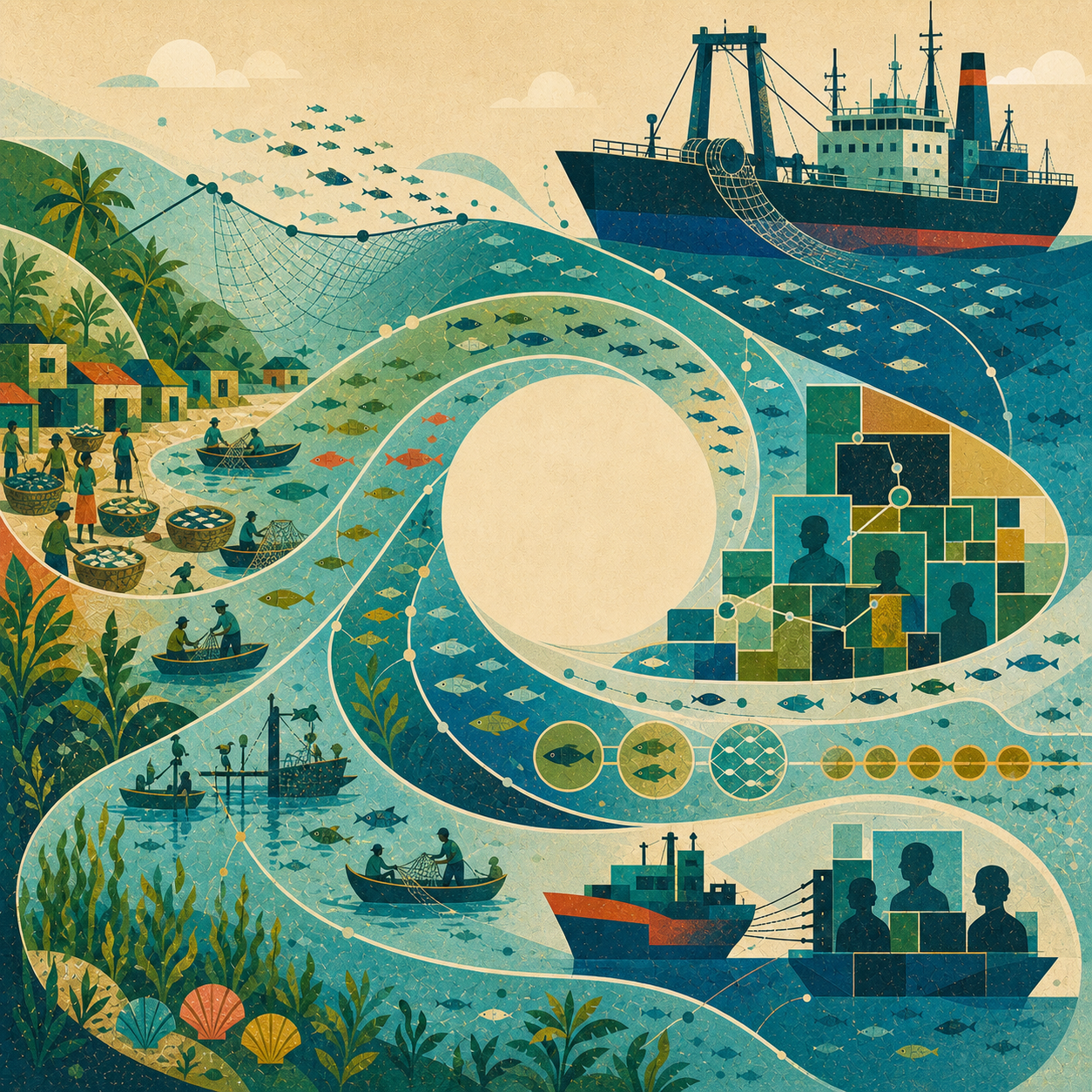
The session artwork combines large industrial vessels, small coastal boats, fish flows and ownership-like grids. It treats opacity as a system stretched across jurisdictions rather than a problem located on one boat.
Abstract: Distant-water fleets, local consequences: lessons from a case study in Liberia
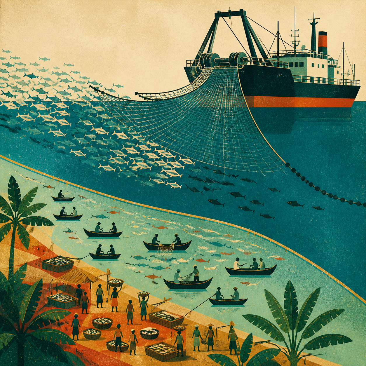
For the individual paper, the composition narrows to opposing scales: one oversized industrial form above a granular field of local boats, markets and livelihoods. The scored boundary between them represents both pressure and the preferential-access area intended to protect small-scale fishers.
Session: Economic and Policy Pathways for Scaling Low-Trophic Aquaculture
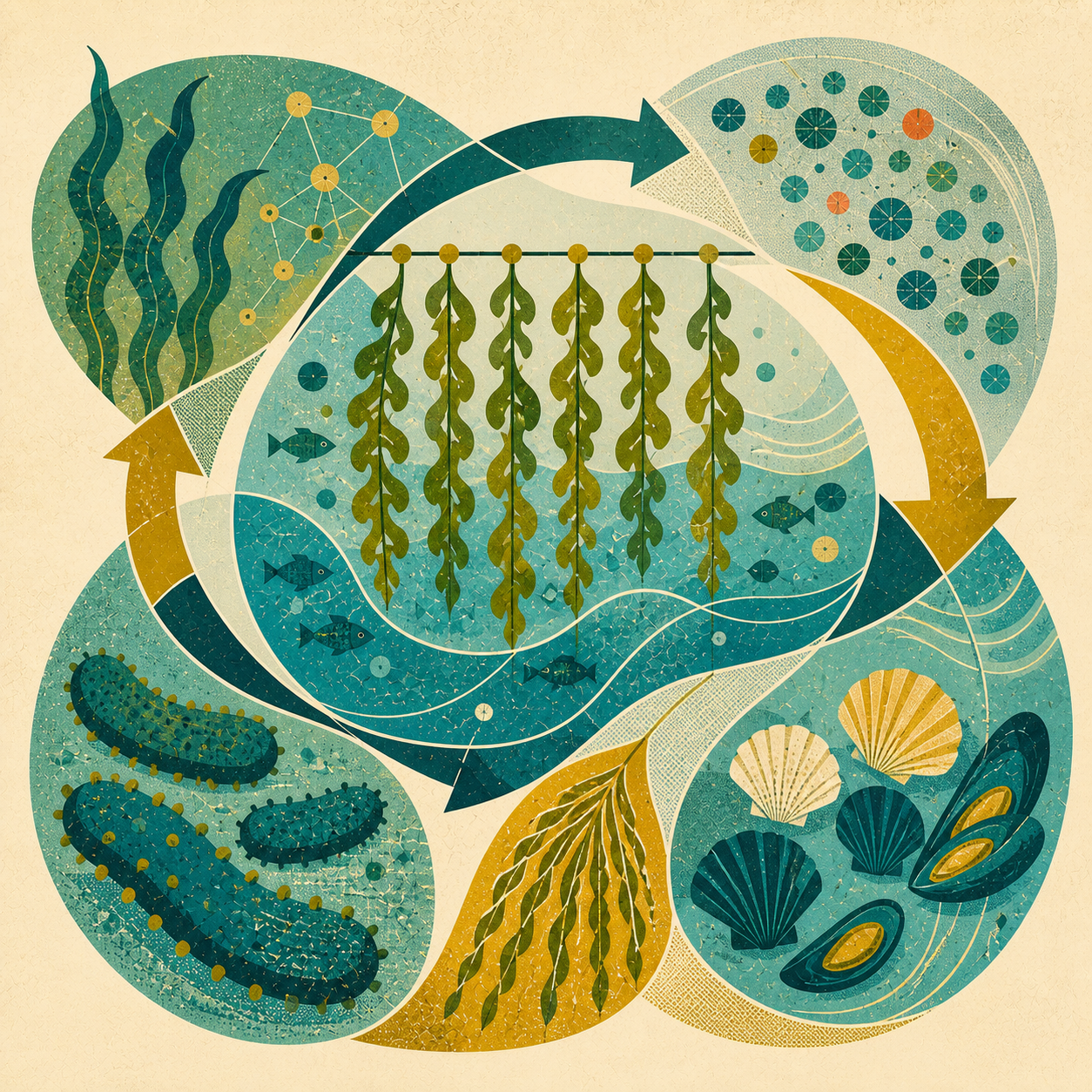
At the session level, kelp, shellfish and other low-trophic species form a circular system. The arrows and interlocking production forms emphasise integration and scaling across species, technologies and policy.
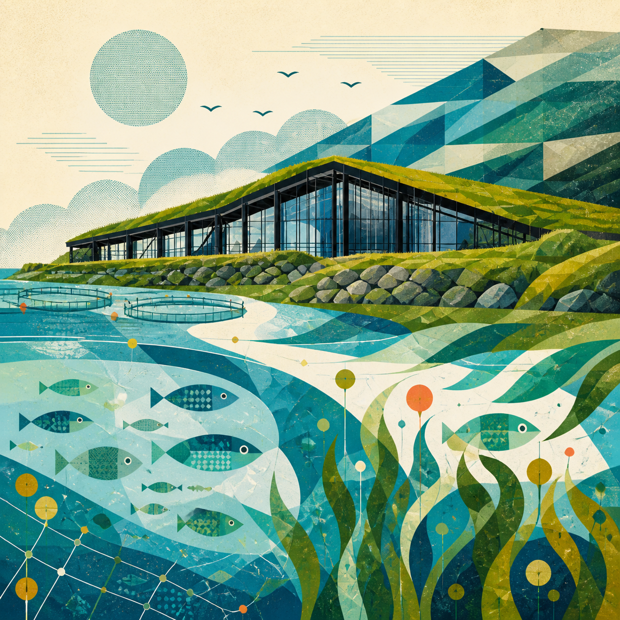
Abstract: Pathways to reducing the cultivation cost of seaweed in the Faroe Islands
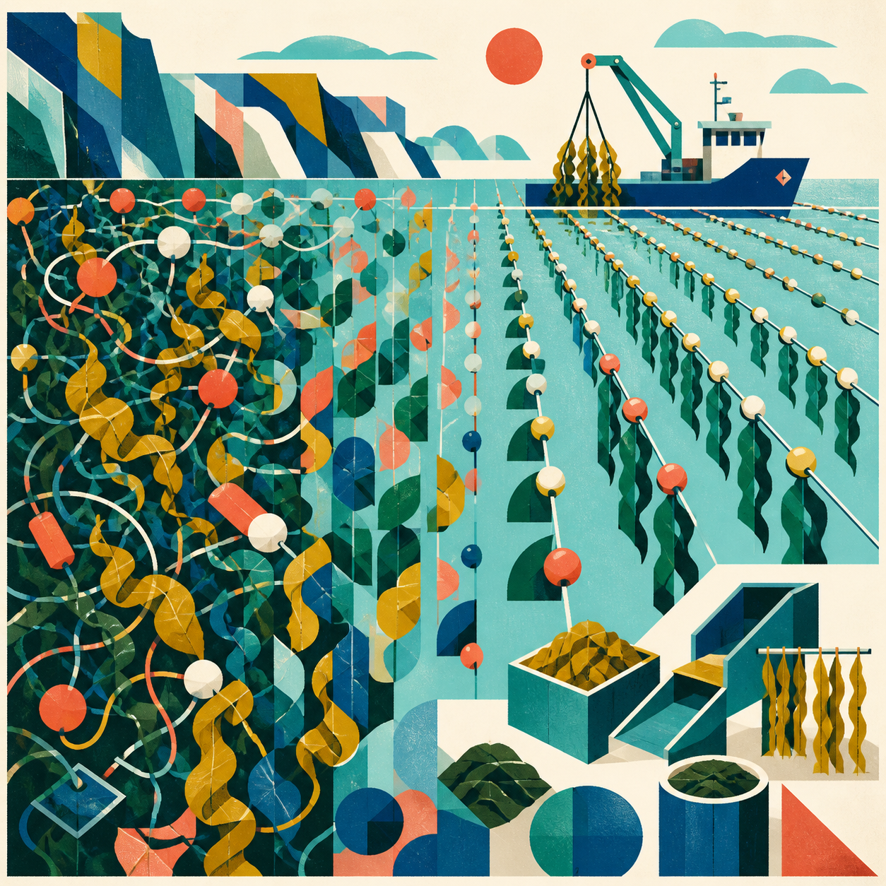
The paper's artwork expresses learning as subtraction. Dense, uncertain processes resolve into fewer parallel growlines; abandoned steps remain as ghosts while a clearer route towards lower cultivation cost opens.
One interpretation for every abstract
We created a production record for all 238 papers.
Each record included the title and abstract, its place in the programme, a paper-specific visual mechanism, an individual image brief, alt text and a short interpretation of the finished work.
Image-generation tools made it possible to work at this scale. They did not solve the central problem: deciding what each picture should mean.
The final collection contains 233 newly generated works and five pieces promoted from the earlier style study. Every paper had its own brief. There was no generic fallback for the difficult ones.
Review happened both one image at a time and at collection scale.
We inspected twelve generation-batch sheets and eight collection-wide contact sheets, looking for repeated compositions, weak marine recognition, accidental text, incorrect subjects and images that had become diagrams rather than artworks.
One result had turned into something resembling a contact sheet instead of a single composition. We rejected it and produced a new unified work.
The completed collection contains 238 distinct square masters. Every work also has its own accessible description and interpretive note.
An artwork has to survive several contexts
Creating the images was only part of the work.
Each piece also had to function as a small programme thumbnail, a full-size image and a printed illustration.
In Luttaka, the lightweight thumbnail appears while someone browses the programme. The full-resolution image is only loaded when they choose to open it. The accompanying note explains the connection between the artwork and the research.
The complete collection also appears in the abstract booklet, where all 238 works sit alongside their respective papers. The same visual language carries into the wider event identity and room material.
This exposed a practical tension.
An image can be compelling at full size and become unreadable as a thumbnail. It can look coherent on a screen and reproduce poorly on paper. A collection can contain good individual works and still feel repetitive when 238 of them are seen together.
So the object we were designing was not merely a set of images.
It was a visual system that had to work across research, software and print.
What we do not know yet
We know the collection is complete. We know every published abstract has a corresponding artwork and that the images work technically across the programme and booklet.
We do not yet know whether they help people.
Will someone recognise a paper they saw earlier because they remember its image?
Will the artwork make it easier to rediscover a subject in a programme containing hundreds of contributions?
Can it make technical research feel more approachable without oversimplifying what the researchers are saying?
Those questions cannot be answered by inspecting files or contact sheets.
The conference begins on Monday. That is when the collection stops being a production exercise and becomes part of how people encounter the research.
We have built a visual hypothesis.
Next week, we get to see whether it works.